Leafy

Leafy needed a full brand identity from scratch. They were looking for a logo, label design, a website for their non-toxic products from plant-based and mineral-based ingredients.

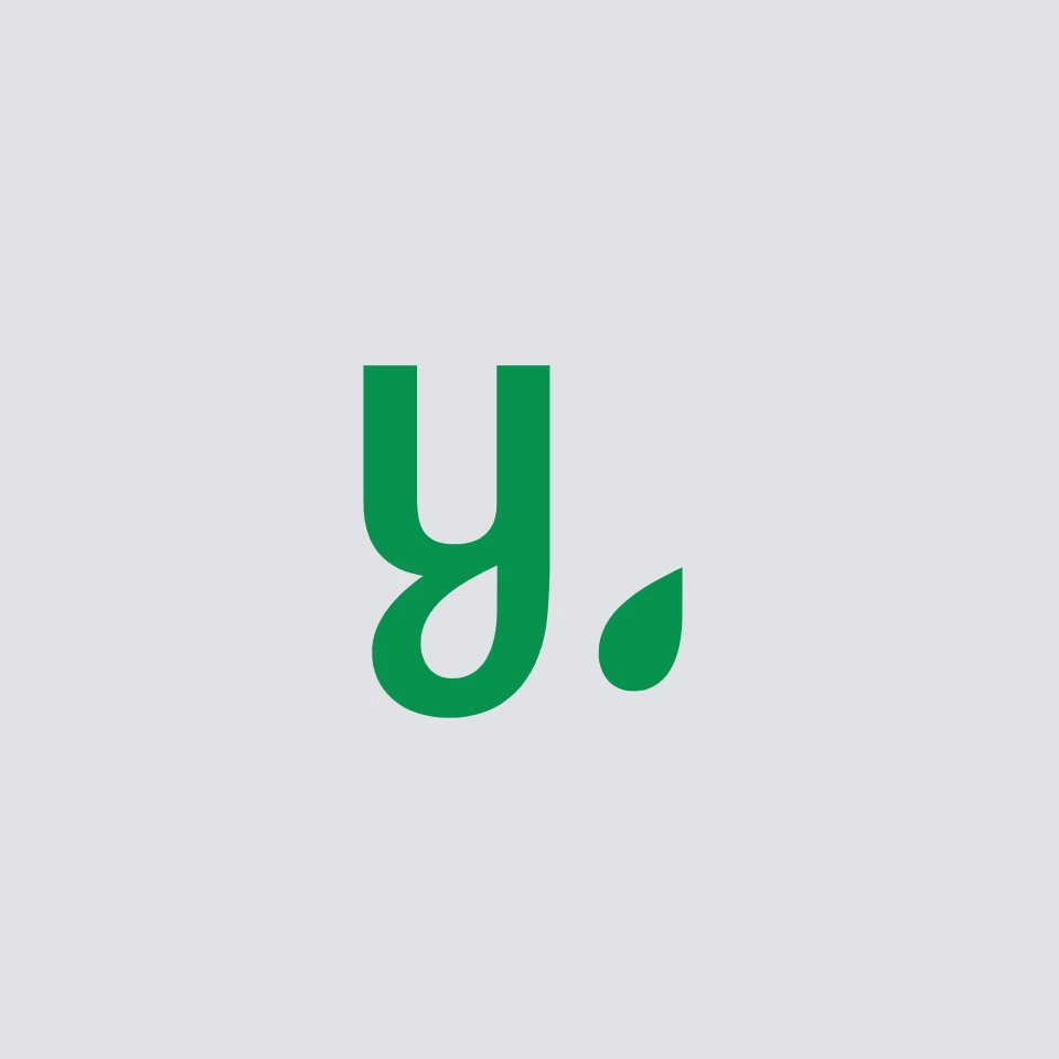
We designed a unique logo with a leaf symbol to highlight their eco-friendly image. A bright blue and yellow color palette inspired by nature carried through to the color-coded labels, a user-friendly website, and custom icons.

The result was a strong, appealing brand identity that made Leafy stand out, engage customers, and effectively communicate the product's natural and non-toxic qualities.
DELIVERABLES
Creative Direction
Logo and Identity Design
Label Design
Website UI/UX
PROJECT DONE AS PART OF
Noble House Media Team
Logo incorporates a leaf symbol, emphasizing the product's natural and eco-friendly characteristics. The negative space within the letter "y" mirrors the leaf icon, reinforcing brand identity and visual cohesion. The leaf symbol doubles as a droplet, subtly representing the spray bottle cleaner product and highlighting its core functionality.
The color palette was inspired by the freshness combination of vibrant blue and yellow hues. These colors evoke a sense of cleanliness and rejuvenation. The blue symbolizes freshness and purity, while the yellow represents the bright, cheerful essence often found in blooming flowers.