
Terraphase 52-page Booklet Design
The client approached me to redesign a 25-page brochure and a set of sales sheets. Through a complete rethink of the layout and content, the project expanded to a 52-page piece. I developed a new design direction that focused on enhancing readability by introducing a clear information architecture. This made the content much easier to follow. Significant attention was given to the image selection and map redesign, ensuring they not only looked visually appealing but also supported the overall clarity and flow of the booklet.
DELIVERABLES
Creative Direction
Print Design
Content Strategy
The cover features rounded shapes paired with angled lines, blending the concepts of nature and technology to create a dynamic, modern design that reflects both the environment and innovation.


The title pages throughout the booklet were redesigned to incorporate brand colors and shapes, giving them a cohesive and professional look. The content page was reworked to list sections in a more logical order, making it easier to navigate and find key information.


The leadership pages got a fresh update with a clear, easy-to-follow layout. The content was broken into bite-sized sections using smart typography, making it a breeze to read at a glance. A pop of brand colors keeps things sharp, clean, and perfectly on-brand


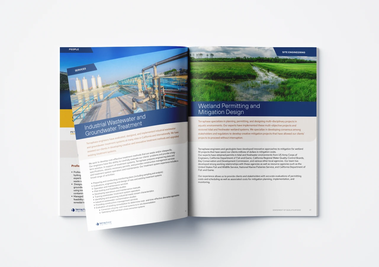
The informational spreads were designed to present content in digestible chunks, establishing a clear pattern that the reader can easily follow and absorb at a glance.


The map was redesigned to make office locations and state certifications easy to spot, with a clean, intuitive layout that makes the information clear and accessible.

Alongside the redesigned booklet, a set of sales sheets was created to serve as an effective entry point for conversation. These concise, visually engaging sheets are designed to spark interest and facilitate discussions, complementing the brochure by offering key information in a more direct and approachable format.


